Insurecompare
Helping users find the right insurance with confidence
Helping users find the right insurance with confidence
InsureCompare is a web-based platform fundamentally built on trust, designed to help users find the best insurance policies based on their unique needs and preferences.
Insurance decisions are often overwhelming, too many options and too much small print. Many tools offer one-size-fits-all solutions that overlook individual needs and priorities. Some users just want a quick, straightforward comparison, while others need to dive into coverage details or assess specific benefits.
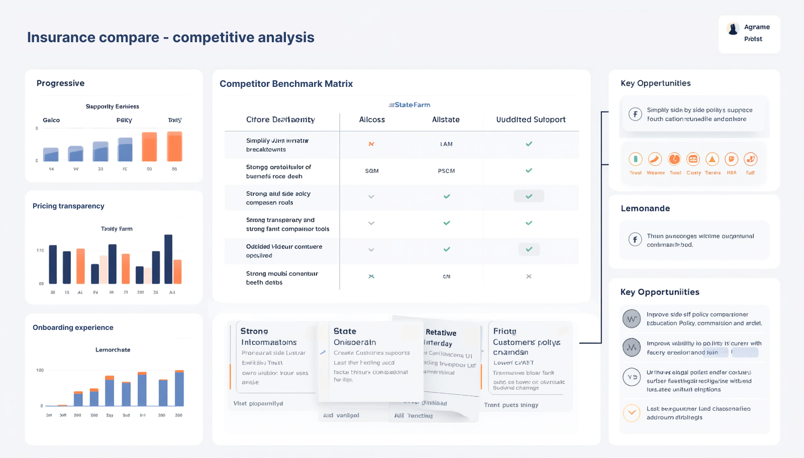
Conducted competitive analysis across 3 key insurance comparison platforms to identify patterns in search, comparison and checkout flows
Drawing from these insights, InsureCompare was designed to create a more transparent, intuitive, and trust-driven insurance comparison experience.”
These principles define the design direction behind InsureCompare, focusing on clarity, trust and decision confidence.
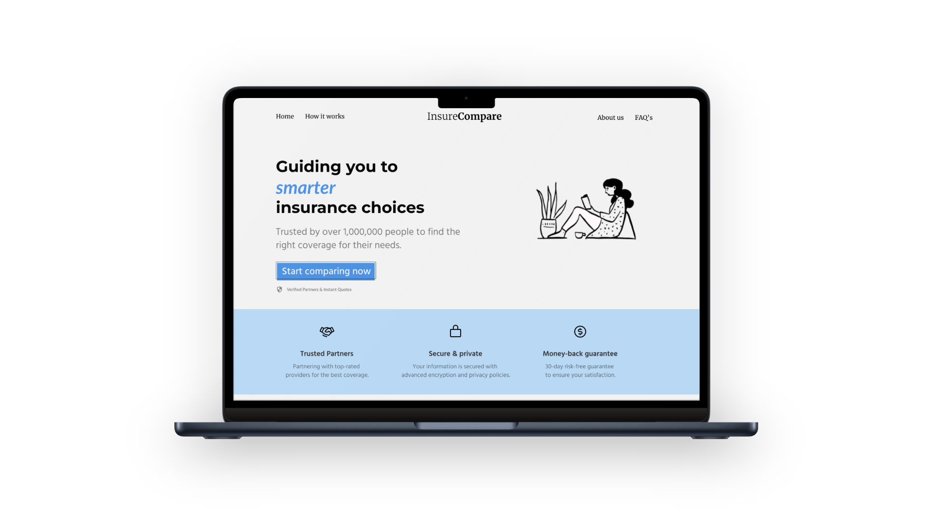
Above-the-fold content is designed to draw attention and prompt users to begin comparing policies immediately.
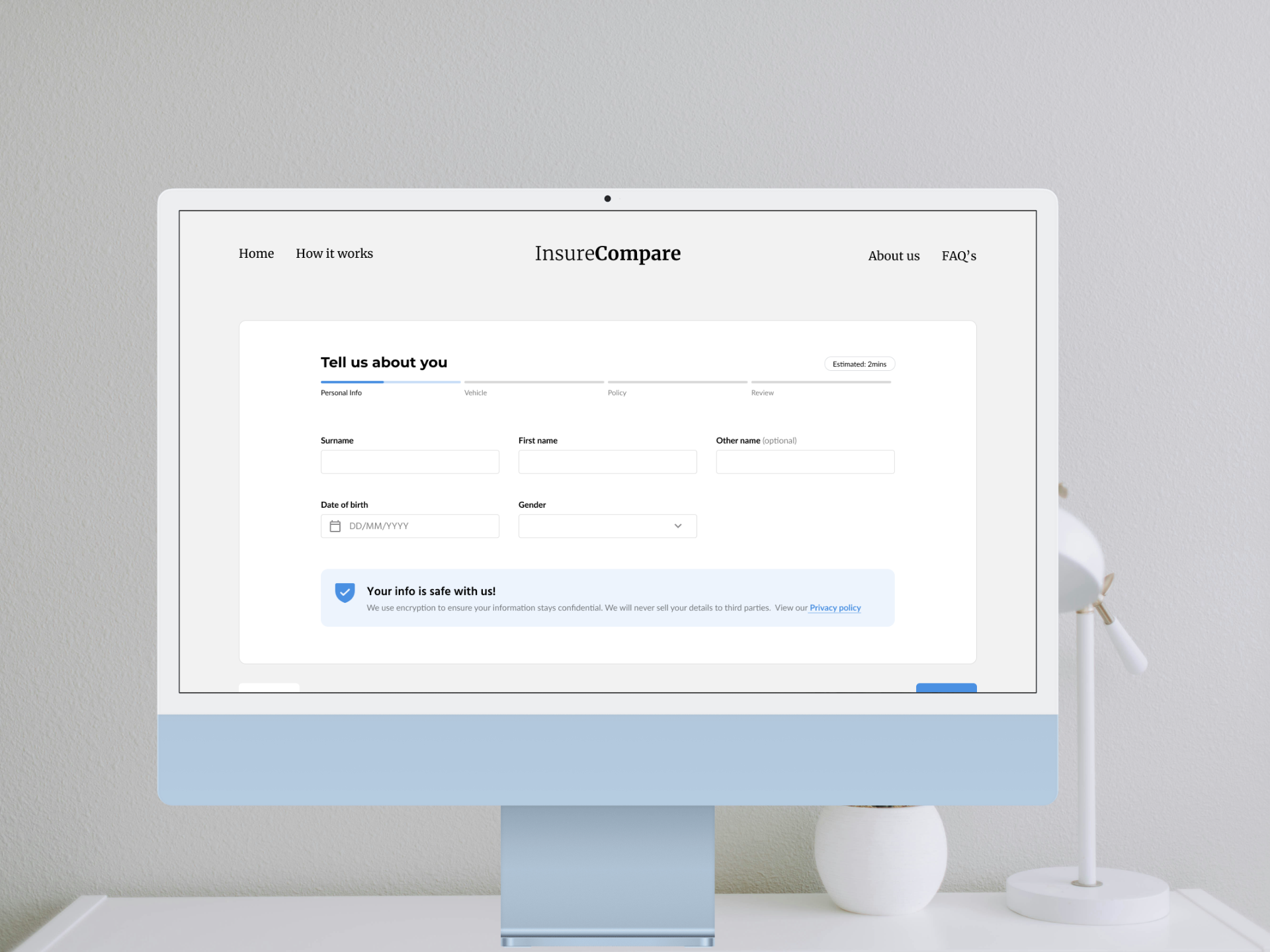
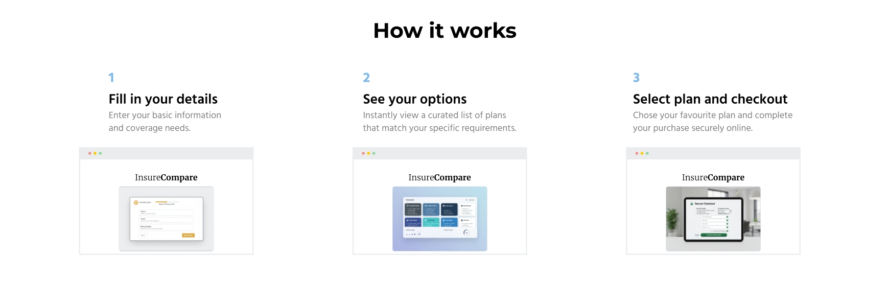
A guided demonstration of the insurance and purchase journey, helping users understand the process
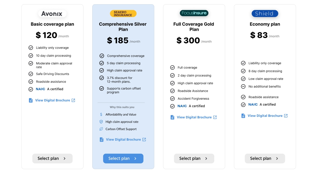
Insurance options are structured into digestible comparisons to reduce decision fatigue.
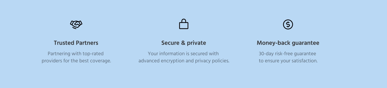
Trust was established on the landing page using cues such as security and privacy messaging and a money-back guarantee to build initial confidence.
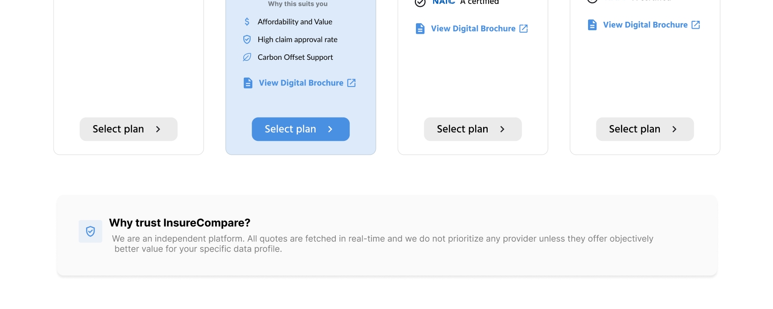
Reassurance cues were introduced during the insurance purchase flow, reinforcing trust at critical decision points such as checkout.
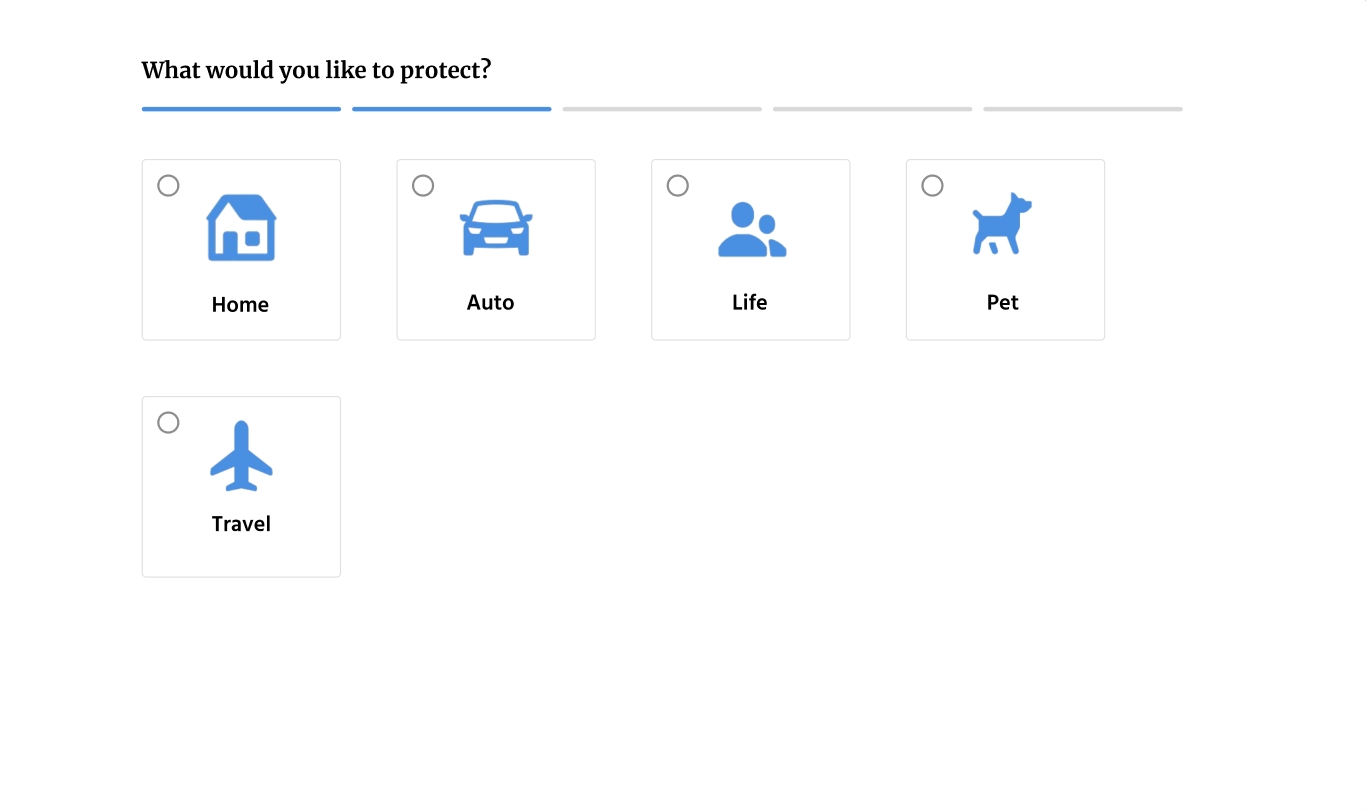
Explored multiple iterations to improve clarity, simplify comparison flows and strengthen user confidence throughout the journey.
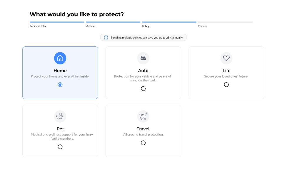
The experience introduced a clearer and more guided insurance comparison flow, with improved information hierarchy and stronger trust cues across key decision points. By surfacing key actions earlier and reinforcing credibility throughout the journey, the experience aimed to make it easier for users to move from exploration to comparison and purchase with greater confidence. Overall, the redesign focused on reducing decision friction, improving clarity in policy evaluation and supporting more confident decision-making across the insurance purchase journey.
Impact is to be evaluated across these areas