KentaPay
UX audit and conversion-focused redesign for a Pan-African fintech platform.
UX audit and conversion-focused redesign for a Pan-African fintech platform.
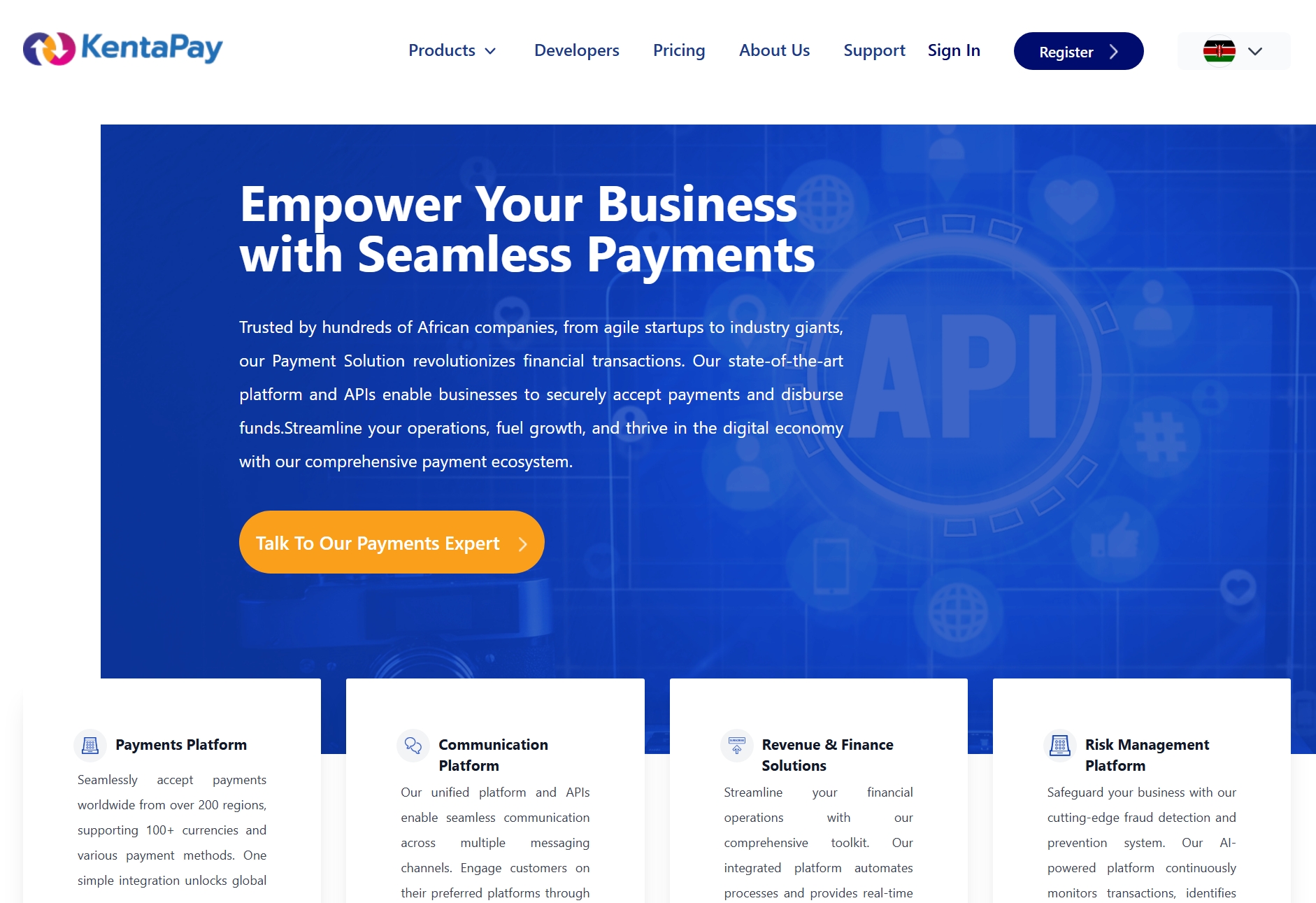
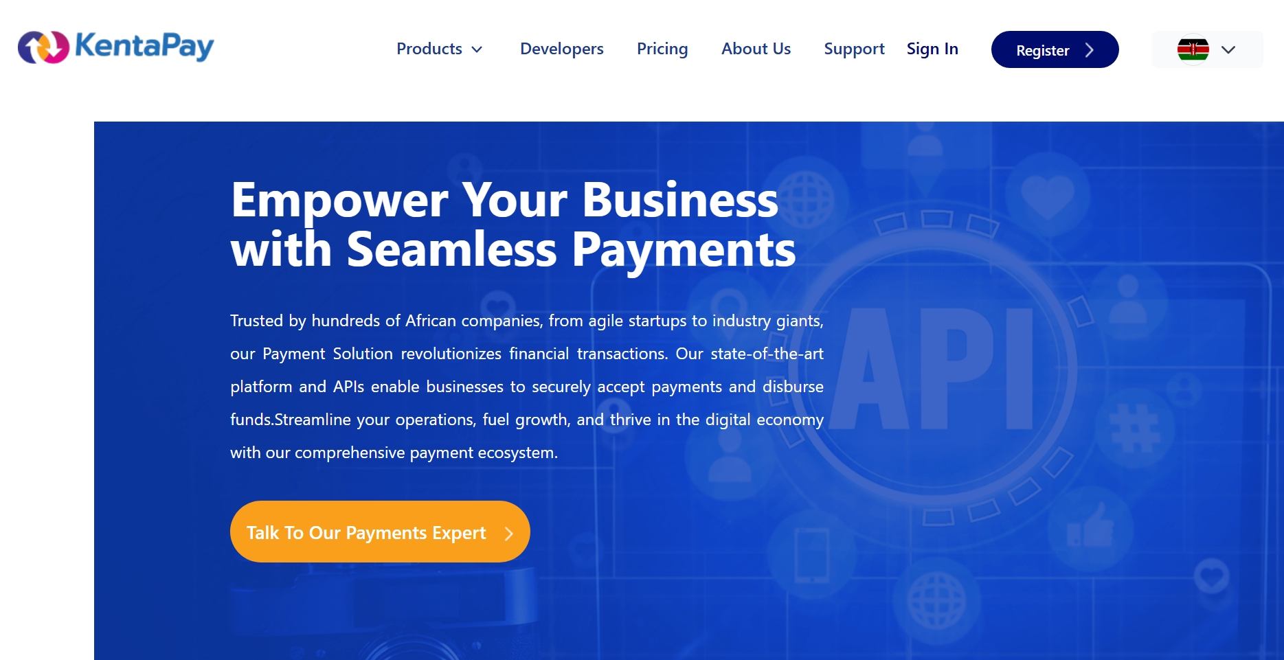
KentaPay is a fintech infrastructure platform offering payment solutions for businesses, freelancers and financial institutions across Africa. As the platform evolved, new services were added without a clear redesign of the experience, resulting in a dense interface.
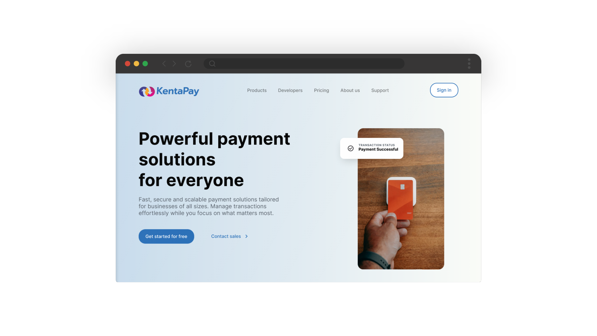
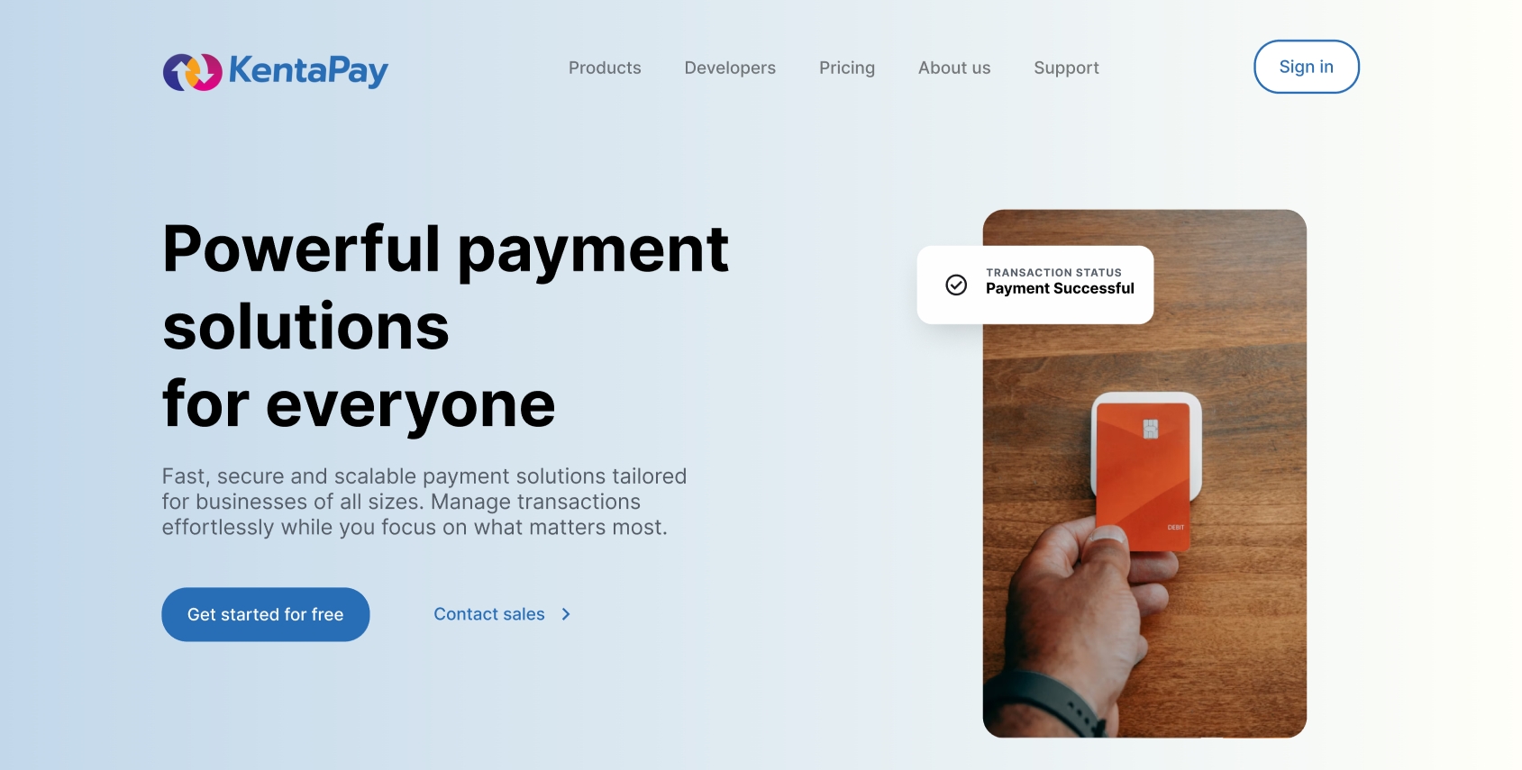
The landing page lacked clear hierarchy and intent-based structure, making it difficult for users to quickly understand the product and find relevant solutions.
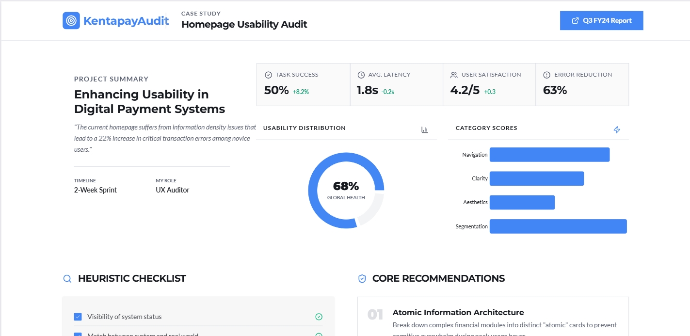
The audit identified key usability and conversion issues across the platform through a structured evaluation process.
These principles define the design direction behind InsureCompare.
Designed the homepage around user intent rather than internal business categories, allowing visitors to identify relevant solutions faster.

We restructured the page hierarchy to communicate KentaPay's value proposition and guide users toward a clear primary action.

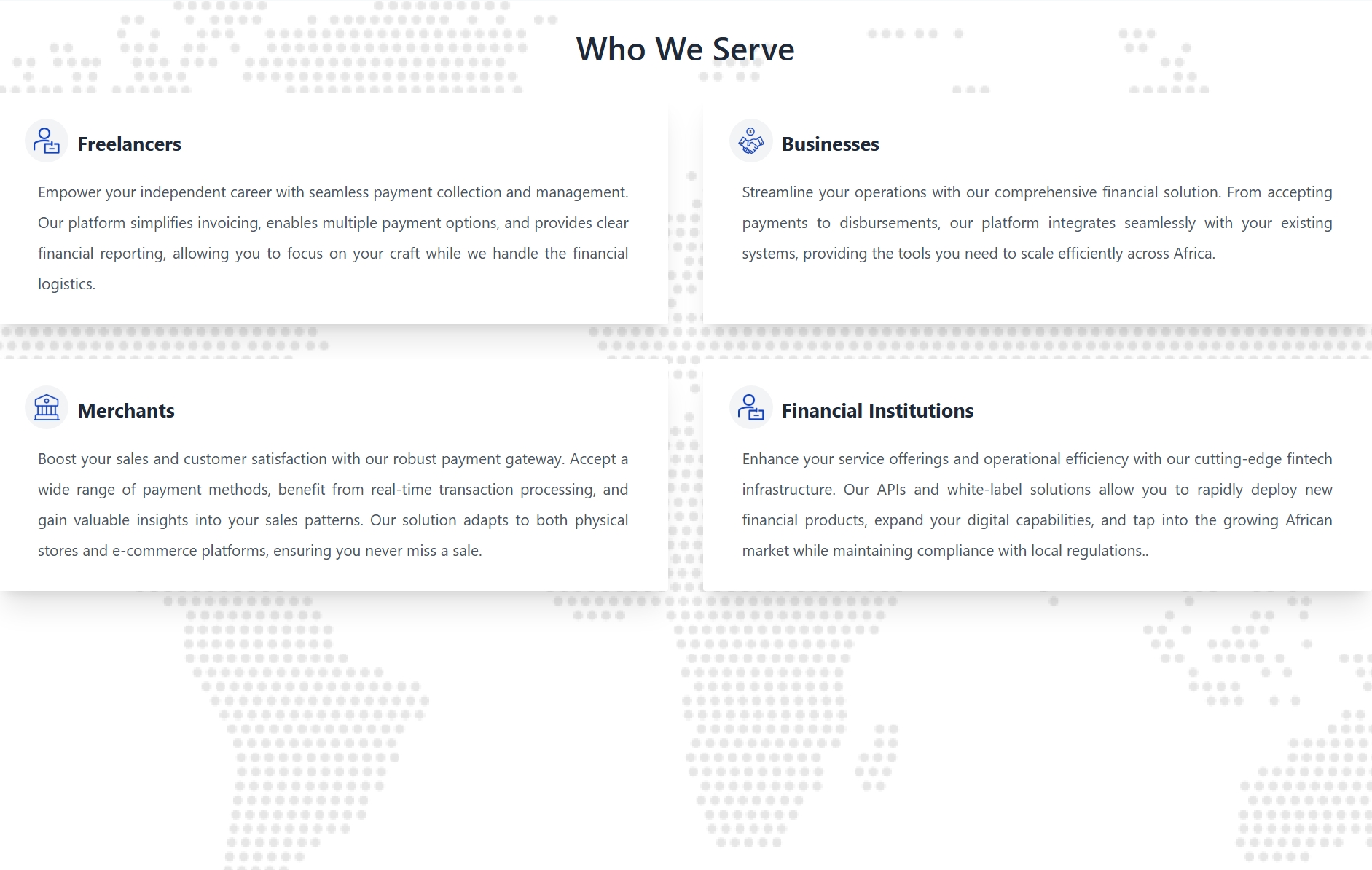
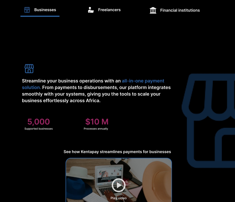
Simplified content structure and introduced stronger visual hierarchy to improve scanability and reduce reading fatigue across long-form sections

Multiple iterations were explored to improve clarity, simplify comparison flows, and strengthen user confidence throughout the insurance journey.
The redesigned KentaPay experience is expected to significantly improve user conversion rates by simplifying and streamlining the overall payment flow, reducing friction during onboarding and checkout processes. With a more structured information hierarchy and clearer visual communication, users will be able to navigate the platform more efficiently, leading to reduced drop-offs at critical stages.